Design and prototype faster with the Rocket UI Figma Kit
Explore a complete and flexible UI system with reusable components and layout structures, designed to scale with your product and accelerate your design workflow.
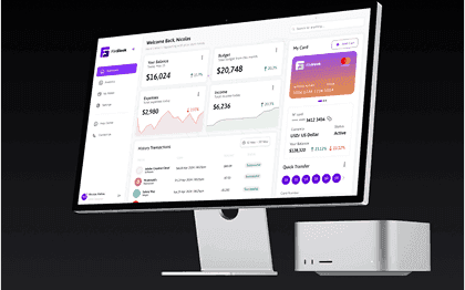
Ready-to-Use Components
Includes pre-built buttons, input fields, modals, cards, and more to jumpstart your app designs.
Fully Responsive Layouts
Design for any device with templates optimized for desktop, tablet, and mobile views.
OutSystems & Mendix Ready
Built with your platform in mind for seamless design-to-development handoff.
Auto Layout & Smart Components
Easily customize components with Figma’s auto layout and smart variants for rapid iteration.
Pixel-Perfect Design
Ensure high-quality, precise designs that translate smoothly to development.
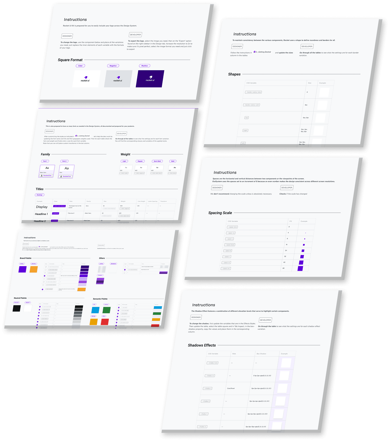
Design Tokens
Utilize consistent design tokens like color, typography, and spacing for effortless communication between designers and developers.
1000+ Components and variants
500+ Pre Designed UI Blocks
Solid, Functional and Customizable